


The Importance of User Testing in Product Design: Why Real People Matter
Imagine pouring your heart and soul into designing a product, only to discover after launch that…
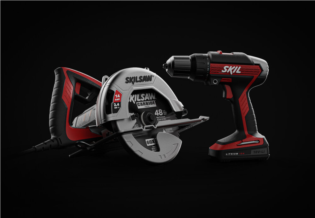
Brainstorming Techniques for Successful Product Innovation: Spark Creativity and Generate Winning Ideas
Every innovative product starts with a spark – an idea that has the potential to revolutionize…

How to Calculate the ROI of Product Design: From Intuition to Investment Proof
In the world of business, every decision hinges on one crucial question: will it pay off?…
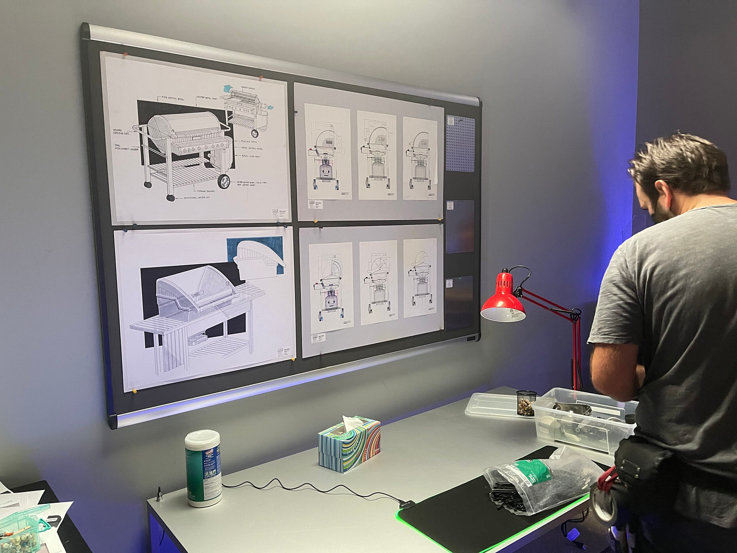
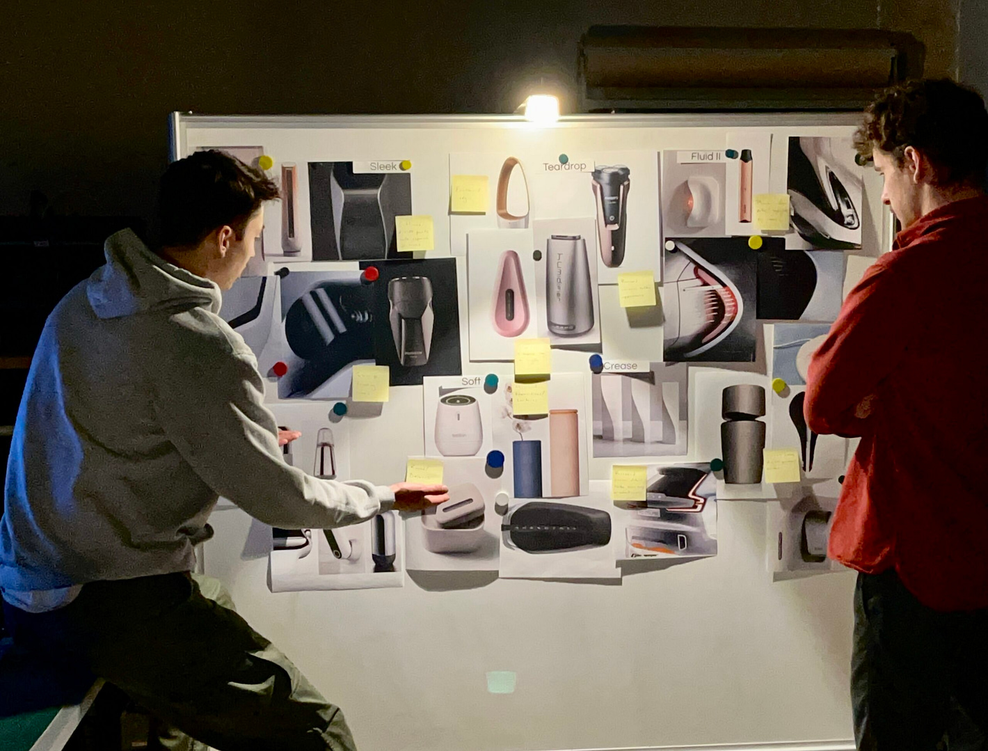
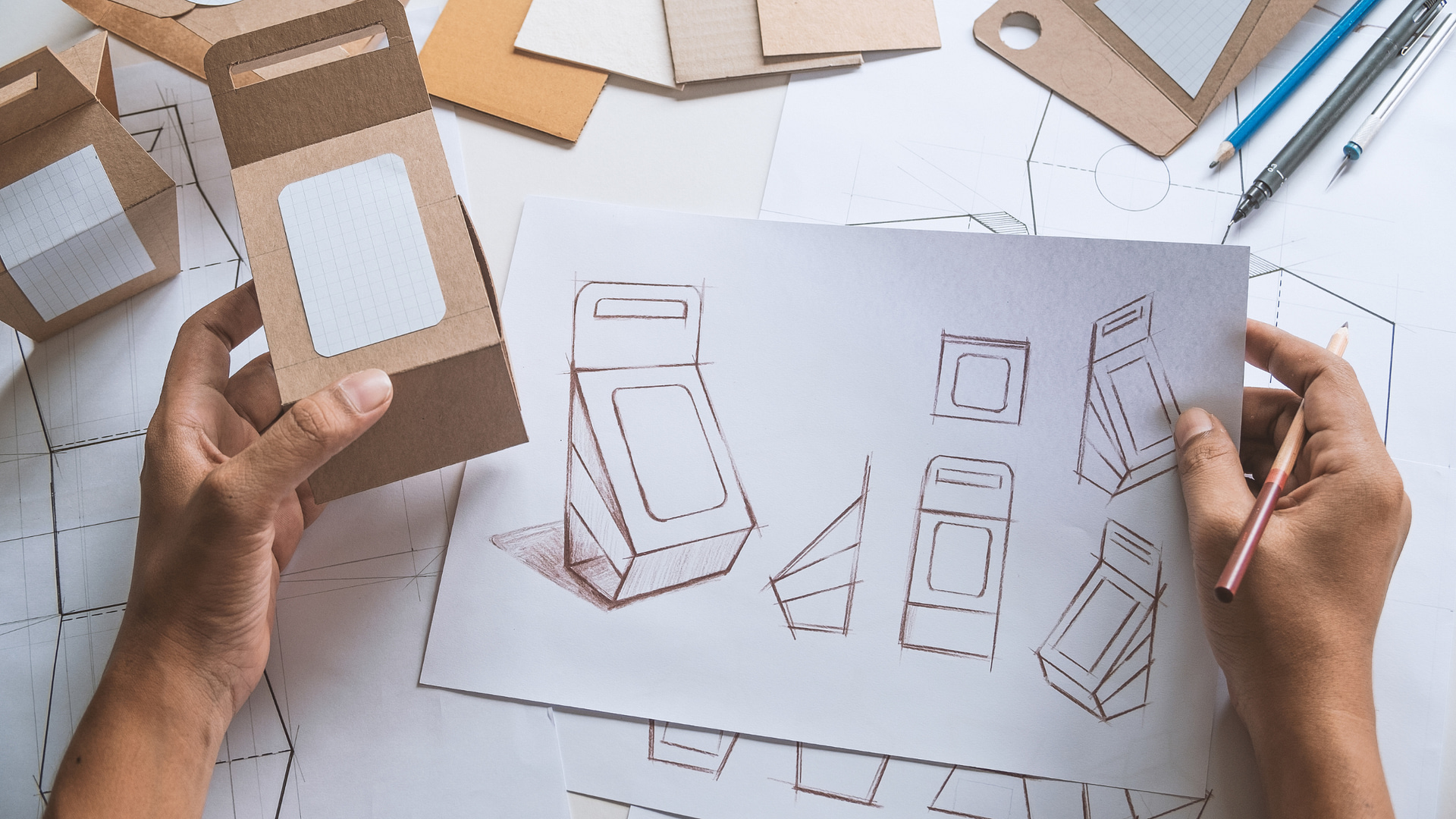
From Whiteboard to Reality: Transforming Business Ideas into Winning Products
Ever have a business idea sketched on a napkin or scribbled on a whiteboard, only to…

How Design Elements Shape Brand Perception
Imagine walking into a sleek, minimalist coffee shop with clean lines, muted colors, and geometric shapes.…
Designing with Intent: The Elements of Design
At Choi Design, we believe every product whispers a story – a tale of intention, functionality,…